THE POWER OF COLOUR - PART 1: EXPLORING THE SEVEN DIFFERENT COLOUR PALETTES
- Apr 11, 2023
- 4 min read
Colour is a powerful tool when it comes to creating a welcoming and inviting space. The right colour scheme can help to promote feelings of relaxation, happiness, and calmness, while the wrong colour choices can leave you feeling agitated, stressed, or even sad.
In part 1, we'll explore the different types of colour schemes and how to select colours that work in unison, as well as incorporating the 60-30-10 rule.
In part 2, we'll take a closer look at the impact that different colours can have on your mood, and how to choose the right colours for your home.
Our goal is to help you understand the impact that colour can have on your mood and to provide you with the tools you need to create a space that feels just right. So, whether you're looking to transform your living room, bedroom, or home office, we've got you covered with plenty of inspiration and ideas to help you get started.
60-30-10 RULE
The 60-30-10 rule is a guideline used in interior design for creating a colour scheme that is balanced and visually pleasing. The rooms colour scheme is divided into three parts:
60% of the rooms colour should be a dominant colour. This will be the backdrop of the room and cover majority of the space.
30% of the rooms colour should be a secondary colour, which will add interest and contrast to the dominant colour.
10% of the rooms colour should be an accent colour, which will add a pop of colour and personality to the space.
Following this rule, and incorporating the colour schemes below, you can create a cohesive and well-balanced interior.
COLOUR PALETTES
When it comes to selecting the right colour scheme for your interiors, there are many factors to consider, such as the size of the room, the natural lighting, and the overall aesthetic you're trying to achieve. Colour schemes can be used to create a harmonious and cohesive space, or to add pops of visual interest and contrast.
We will explore the seven different types of colour schemes for interiors: monochromatic, analogous, complementary, split complementary, triadic, square, and rectangle (tetradic). Each scheme has its own unique characteristics, and whether you're redesigning your home or commercial space, understanding these colour schemes will help you make informed decisions when it comes to selecting colours for your interiors.

MONOCHROMATIC

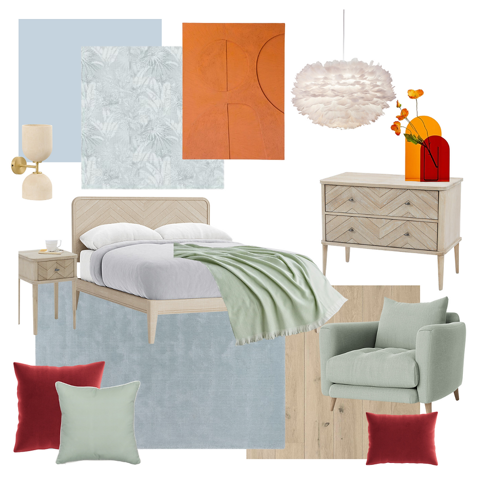
A monochromatic colour palette uses varying shades and tones of the same colour. For example, if you choose blue as your base colour, you can add pale blue, light blue, or navy to create a cohesive and harmonious look. This colour palette is elegant, sophisticated, and creates a calming atmosphere. It is also an excellent option for smaller spaces as it creates an illusion of depth and space.

ANALOGOUS

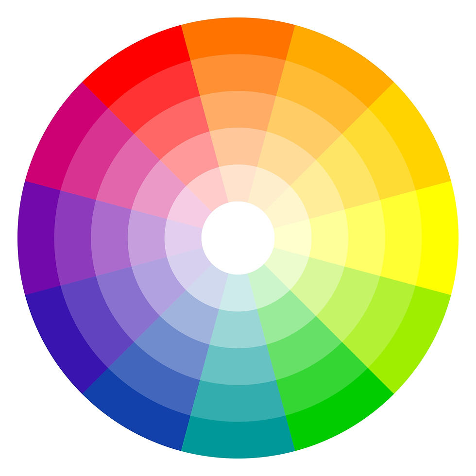
An analogous colour palette uses colours that are next to each other on the colour wheel and creates a harmonious and relaxing atmosphere when used together, and works well in both small and large spaces. It is typically composed of one dominant colour, such as a primary or secondary colour, and then a supporting colour which is a secondary or tertiary colour, and a third colour that is a mix of the two.

COMPLEMENTARY

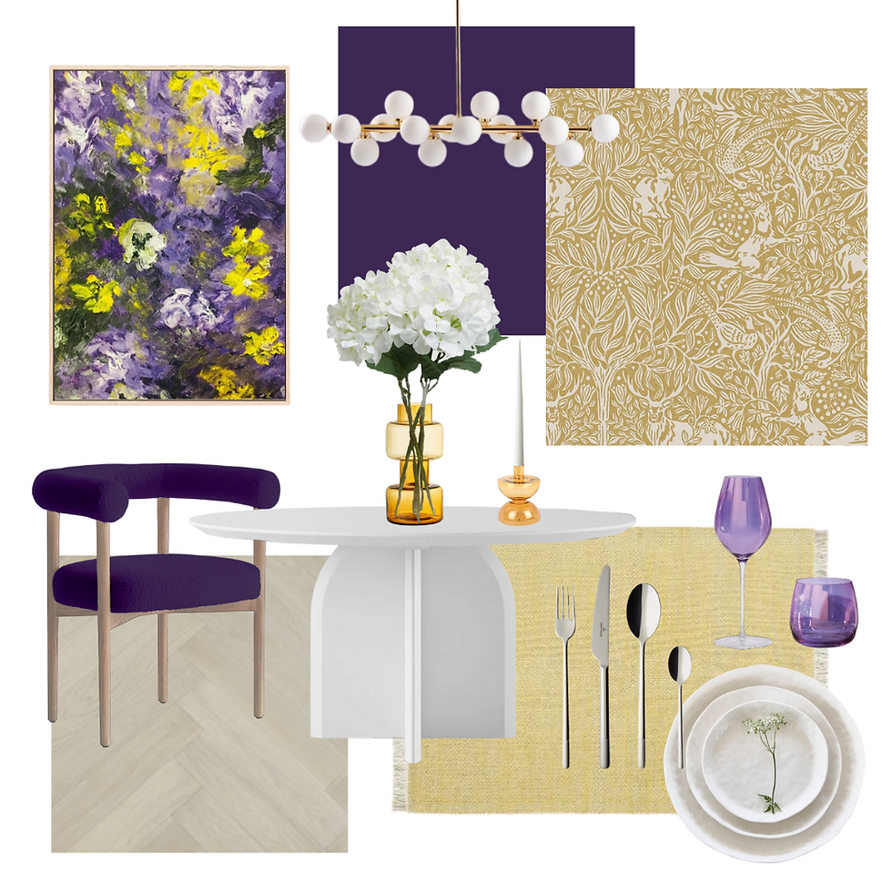
A complementary colour palette uses colours that are opposite each other on the colour wheel. For example, blue and orange, green and red, or yellow and purple. This colour scheme creates a vibrant and energetic atmosphere, making it an excellent option for entertaining spaces such as the living room or dining room. It is essential to use complementary colours carefully and in moderation as too much of either colour can be overwhelming.

SPLIT COMPLEMENTARY

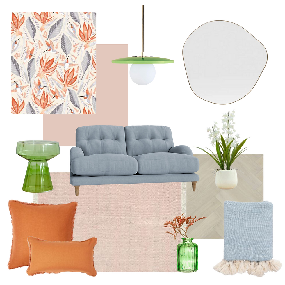
A split complementary colour palette consists of three colours; a base colour and two secondary colours that are adjacent to its complement. For example, a split complementary palette for a room could consist of blue, orange, and pink. This creates a vibrant and balanced look that allows for a lot of flexibility in terms of accent pieces and décor.

TRIADIC

A triadic colour palette combines three colours that are equally spaced on the colour wheel. This creates a vibrant and balanced look that can be bold or subtle depending on the specific colours chosen. For example, a triadic palette could consist of blue, red, and yellow. By choosing one dominant colour and using the other two as accents, a triadic colour scheme can be both visually appealing and functional.

SQUARE

A square colour palette consists of four colours that are evenly spaced around the colour wheel, forming a square. The four colours can be used in varying proportions and combinations to create different moods and aesthetics, making it a versatile option.

RECTANGLE (TETRADIC)

A rectangle colour palette, also called the tetradic colour palette uses four colours arranged into two complementary pairs in a rectangular shape on the colour wheel. This creates a more dynamic colour scheme than a square palette, and works best with one of the four colours being dominant.

PERSONALITY IS KEY!
Injecting your own personality into your interior space can make it feel more like a reflection of yourself and help create a sense of comfort and belonging. One way to do this is by incorporating personal items such as family photos, artwork, or sentimental objects into the décor. Another way is by using colours and patterns that reflect your personal style, whether that's bold and vibrant or more subdued and calming. Adding unique and unexpected touches such as vintage pieces, statement lighting fixtures, or handcrafted items can also make your space feel more personalised. Ultimately, the key to injecting your personality into your interior space is to infuse it with elements that bring you joy and make you feel at home.
The study of colour and its impact on human psychology is an ongoing and fascinating field of research. The emotions, thoughts, and behaviours that colours evoke in us are complex and multifaceted, and there is still much to uncover about this topic.
In part two, we will delve deeper into the impact that each colour can have on our emotions, thoughts, and behaviour, shedding light on the fascinating relationship between colour and the human psyche.
